

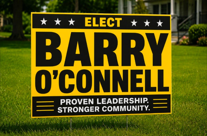
THE ART AND SCIENCE OF POLITICAL SIGNS: WHY SOME WORK AND MOST FAIL
Political yard signs look simple, but they obey a set of rules as strict as highway signage, billboard design, and brand psychology. A sign is not a message, not a biography, not a résumé, and not a miniature campaign brochure.
A sign is a name‑recognition device, and its only job is to make the voter carry one word into the voting booth: the last name.
Everything that interferes with that is a bad sign.
1. What a Yard Sign Actually Does
A yard sign is a speed‑read test. The viewer is:
- Driving past at 25–45 mph
- Walking a dog
- Sitting at a red light
- Glancing across a lawn
- Half‑paying attention
The sign has ½ second to deliver the name.
This is why the most important principle is readability at distance.
2. The Four Distances of Sign Effectiveness
Candidates rarely think in terms of distance, but voters experience signs this way.
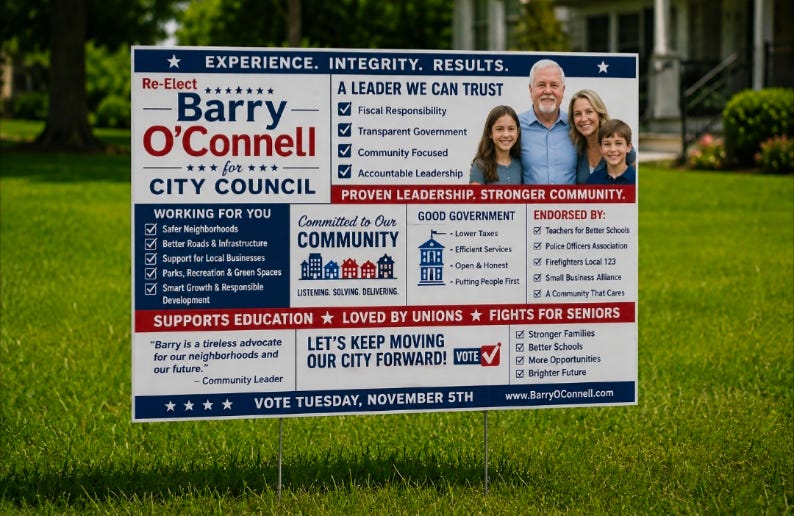
A. The 5‑Foot Sign
This is the worst category.
It requires the viewer to be standing next to the sign to read it.
These signs usually have:
- Cluttered layouts
- Paragraphs of text
- Photos
- Logos
- Slogans
- Dates
- QR codes
- Tiny fonts
These signs are designed like brochures, not billboards.
They are readable only by pedestrians who stop and stare — which almost never happens.
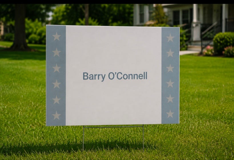
B. The 50‑Foot Sign
This is the “bicycle‑speed” sign.
Readable only if you’re moving slowly.
These signs usually suffer from:
- Low contrast
- Script fonts
- Long names on one line
- Thin strokes
- Pastel backgrounds
They are not terrible, but they are not effective.
Older voters especially struggle with them.
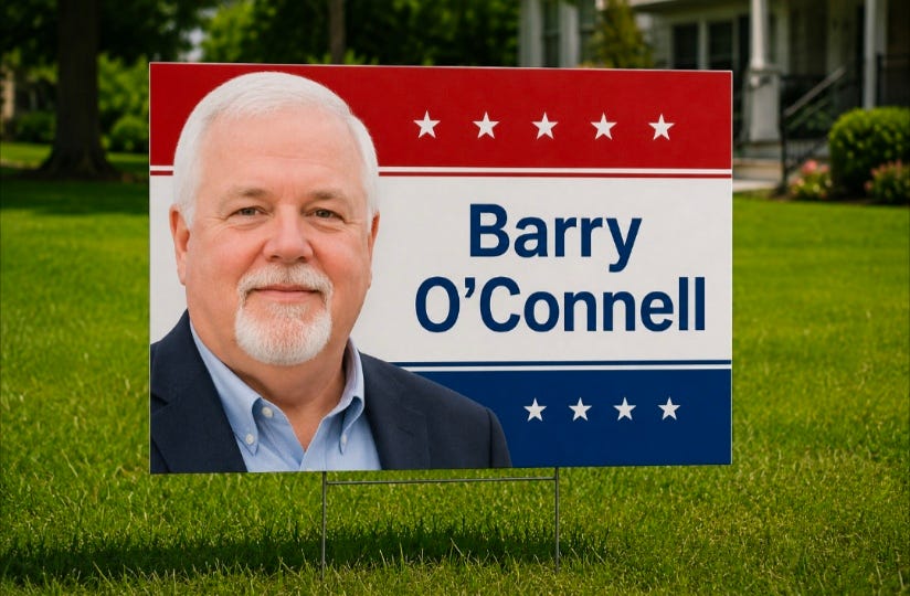
C. The Half‑Block Sign
This is where signs start to matter.
A half‑block sign has:
- High contrast
- A short name or stacked name
- Bold, thick lettering
- A simple color palette
These signs do the job.
They build recognition.

D. The Three‑Block Sign
This is the gold standard.
A three‑block sign is so bold, so simple, and so repetitive that:
- You can read it from far away
- You recognize it even before you read it
- The color scheme becomes a brand
- The sign becomes a visual signature
These signs win the density war.
You don’t even need to read them anymore — you know them.
This is the level where repetition becomes power.
3. The Elements of a Good Sign
High Contrast
The #1 rule.
White on navy.
Yellow on black.
Black on white.
Red on white.
Short or Stacked Names
Long names kill signs.
Stacking saves them.
Bold Sans‑Serif Fonts
Thick strokes.
No script.
No serifs.
Minimal Text
The name is the message.
Everything else is noise.
Two Colors Maximum
Three only if one is white.
Repetition
A mediocre sign repeated 300 times beats a perfect sign repeated 30 times.
4. The Elements of a Bad Sign
Low Contrast
Navy on baby blue.
Red on burgundy.
Green on teal.
Pretty up close, useless at distance.
Clutter
Photos, slogans, bullet points, QR codes, dates, logos.
All of it shrinks the name.
Long Names in One Line
This forces tiny letters and long line length.
The eye cannot process it at speed.
Script Fonts
Elegant in print.
Invisible at 40 mph.
Wasted Space
Margins too big.
Name too small.
Empty corners.
Designers love whitespace; voters don’t.
5. The Accidental Genius Sign: The Olive‑Green Disaster
One of the most effective signs ever seen in a small town was a printer’s mistake:
- White letters
- Chocolate‑brown background
- Water‑soluble ink
- No clear coat
After the first rainstorm, the signs turned:
- Olive green
- Streaky
- Ugly
- Impossible to ignore
People talked about them for weeks:
> “Did you see what happened to those signs?”
They became a local phenomenon.
Everyone looked.
Everyone noticed.
Everyone remembered the name.
It was accidental, but it proved a truth:
> A sign that forces attention — even through ugliness — is more effective than a beautiful sign nobody sees.
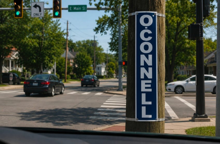
6. The Lost Art of Strip Signs on Poles
Strip signs used to be everywhere:
- Narrow
- High contrast
- Just the last name
- Placed at intersections
- Repeated dozens of times
They worked because:
- Drivers sit at red lights
- The name is the only content
- Repetition builds memory
Modern Best Practice
Avoid staples — linemen hate them and utilities can object.
Use:
- Clear strapping tape
- A top band
- A bottom band
- A tight wrap
It’s cleaner, safer, and less destructive.
7. The Core Principle: The Name Is the Message
A sign should answer one question:
> What name do I want the voter to remember?
Not:
- What office
- What slogan
- What values
- What biography
- What date
- What photo
Those belong on mailers, websites, and door hangers.
A sign is a name‑delivery device.
If the name is not the largest, boldest, most readable element,
the sign has failed.
8. The Final Rule: If You Can’t Read It, It Doesn’t Exist
A sign that cannot be read at distance is not a sign.
It is lawn decoration.
A sign that can be read from three blocks away is not decoration.
It is political infrastructure.